Paintings and the Art of Self-Referencing
A year ago I wrote about putting paintings and wall art in models. I recommended a trick using walls, niches, and aligning 3D textures. It’s a good technique, but I have to admit that I now rarely use it for hanging pictures. I finally got around to using the Picture 15 object. It’s great and fast. Put whatever image you want in your loaded library, choose custom picture and then type in the image’s name that you want to use. Very easy. If you want to avoid distortion of the image, you’ll need to know the proportions of the image so that you can size the object properly; the object won’t size itself automatically. It’ll just squish the image.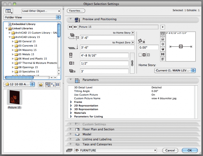
While hanging a picture in a model is easy, choosing what to hang is a lot harder. In my first endeavor, I hung a Klimt. It’s been a running joke with the clients, who are both art lovers and collectors. I’m tempted to frame a poster of the painting and give it to them as a housewarming gift. But their taste in art is so impeccable, a joke poster would get dusty in a closet. And while it’s been fun to see this priceless piece of art in the model, it doesn’t reinforce the design or the feeling of being in the space. So what else could be hung? For critical collections, I’d recommend photographing all the art a client has and hanging it virtually. Doing a museum? Include the art. That’s a no-brainer. This is where visualization and pretty models start reinforcing the ‘I’ in BIM.
Fake Art
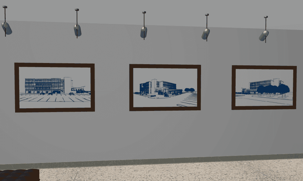
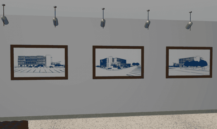
But what do you do if you have no art collection and you don’t want to crib masterpieces? What about hanging images of the project as paintings? I did this for a recent project. It’s an office building and I had a lobby space that needed something on the walls. I took some abstract sketch renderings of the exterior and hung them as art. Now the lobby has more character and charm. And more importantly the client, as he explores the model within BIMx, ArchiCAD, or via still images, is seeing what he hired me to create. It’s also a great opportunity to highlight specific vignettes and moments that I love in the project. My clients with the virtual Klimt are looking at a Klimt in their soon to be real home. Why not have them look at images of the house? That’s what they are paying for. And there’s just something beautiful and surreal about images of the 3D model within the 3D model.
In this example I used the default blaureiter setting, but I think most of the Sketch Rendering options could produce great fake art. Photo realistic images would probably work just as well, but might be too distracting if done wrong. More on that in a moment.
TVs, Plotters, Computer Screens, and Self Promotion
Just like the Picture 15 object, the TVs, monitors, computers, and laptop objects can all have custom pictures on their screens. It’s the same process as the Picture 15 object. Why not set the computer screens to your company logo or perhaps your website? If it’s a professional client, put their logo up on all the screens. Many residential clients are also business owners–show those logos or iconic products. The model is a representation of the clients future building. Infuse it with images they love and care about. Though probably avoid framed photos of their kids and spouses, as that might go from cool to creepy, perhaps falling into the Uncanny valley.
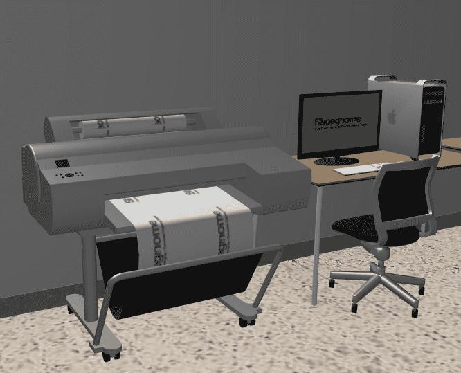
The plotter in the image below uses the same premise as the screen-type objects, but instead of a custom picture, I created a new material with the Shoegnome logo and applied it to the paper. Why print white paper when you can actually PRINT something. Why not get super self-referential and have the plotter printing plans of the building? That wouldn’t be hard. And I bet your clients would flip out with excitement.
This is probably a good time to mention that in the actual model, the plotter was printing the client’s logo and all the TVs and most of the computer screens had the clients various products and logos on them.
 Paintings to TVs… Art History Comes Full Circle
So remember the post about paintings and frames and how I no longer use that technique for paintings? Well I still use that trick. But now for TVs and other screens that don’t have objects that meet my needs. The TV in the image below (based on a 42″ VIZIO flat screen) is a complex profile wall that is the extrusion of the TV, with 2 complex profile beams for the built in speakers. I used beams because, with a higher priority number than the wall, they cut out the wall that is the body of TV without the need for Solid Element Operations. For the screen I used the niche object and followed my old painting steps.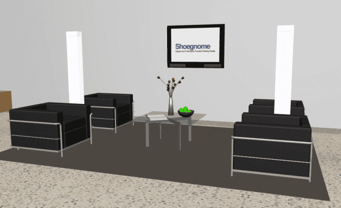
I’ve got a lot more to say, but I’ll end with this…
When we photograph a completed building we take care to stage the images. We should do the same with our models. The techniques may be different, but the philosophies are the same: stage it to show off our design and make it attractive to our audience.
6 thoughts on “TVs, Plotters, Computer Screens, Paintings, and Self Promotion”
great post! I love the plotter trick 😉
Thanks!
Great Tip Jared. You could take this quite far if one wanted to…….
Good article. Thank’s
A project within a project
I usually put my favorite shows on the TV. Mad Men, Psych… I put Fox News on the TV of one of my Democratic clients. The reaction was priceless.