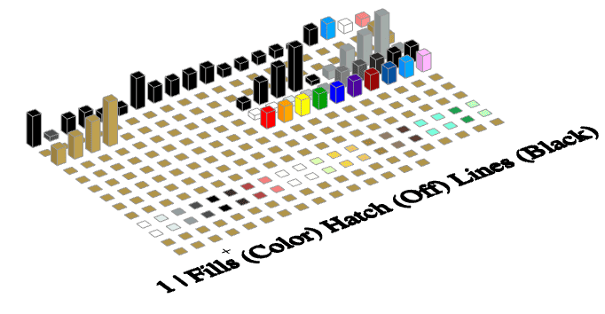
A friend and fellow architect here in Seattle decided to switch to Archicad. As part of his much delayed migration, in early October he’s going to have one of his employees (who has previous Archicad experience) customize my template to match their office standards and specific firm needs. To assist them in their effort, I promised that I’d update my template by October 1st with any fixes or additions that had accrued. This is the first time I’ve set a deadline for a template update and I’m so glad I did. The Shoegnome Open Template v24.1 has 41 items in the change list.
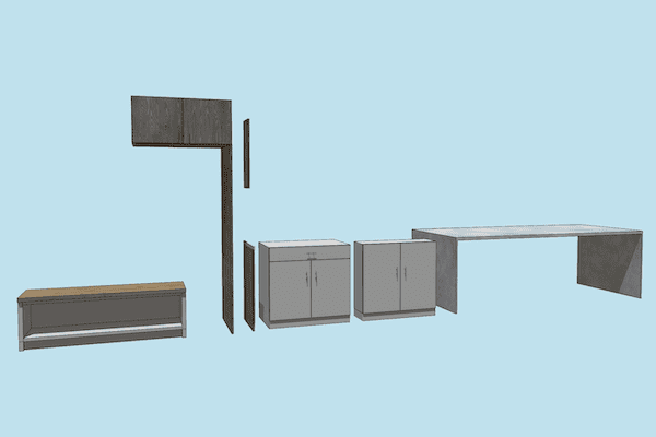
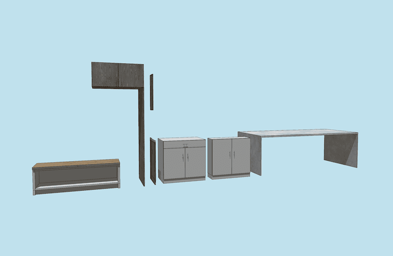
Since my Archicad 24 template is the continuation of my 23 template, I’ve been able to focus on streamlining my processes. Anytime I create something new for a project or notice I’m copying something from an old file, I’m making a note to recreate it as a Favorite or Attribute. That’s about 75% of the list. I put built-in benches in a lot of my projects, especially during schematic design. It’s foolish to recreate it each time. Sure once I get to design development and construction documentation, I might delete the Object and building something custom. But that’s okay. If a project needs customization, I’ll do that. To get client buy-in or to do quick 3D sketching, I need more good options built into the template. Similarly, I find that I’ve been recreating surfaces in my projects for wall tile and painted cabinetry. No more. That’s now in the template.
One of the many, many benefits of sharing my template with everyone is that I get to discover improvements based on other people’s experiences with the template. Back in v23.3, someone emailed me about adding color names to the pens in my Pen Sets. That request led to a conversation about colorized electrical plans.
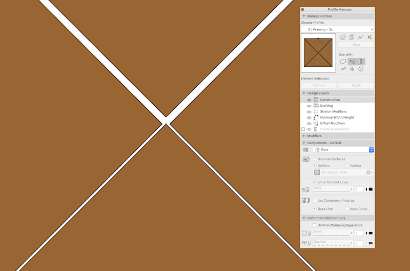
For v24.1, I owe a big thanks to my long time friend and collaborator David Jefferis. He was working on a project of ours and getting increasingly frustrated about how the file was slowing down. He discovered items #29-31 on the change list. Small gaps in the center of the 2x framing Complex Profiles were adding unnecessary complexity to our beams and columns, especially when they were cut by other elements (see the slideshow below for a view showing the error at the maximum possible zoom percentage).
James Murray helped me find item #39. Check out James’ blog post on creating a GDL object that translates pen thickness to height. James tweeted an image of his Pen Set and I responded that I’d love to see my Pen Set like that. The next morning he tweeted back an image of my Pen Set (see the slideshow below). It was immediately obvious I had some unused pens that needed to have their line weights reduced to zero. I never would have noticed that on my own. Thanks James.
If you come across any issues or ideas for the template, please don’t hesitate to share. Comment below or email me.
Shoegnome Open Template v24 changes:
- MVO (Revised): 1 | High Detail, Markers Off: Construction Element Options, Slab, lines set to Eliminate
- Fill (NEW): Tile – Walls – Accent – Vectorial Hatching
- Surface (NEW): 09 | Tile – Walls – Accent
- Surface (NEW):Â 06 | Wood – Millwork – Painted
- Favorite (NEW):Â Dimension Line (Arrows on)
- Favorite (NEW):Â Cooktop – electric
- Favorite (NEW): Shower Niche
- Favorite (NEW): Curtain Rod
- Favorite (NEW):Â Ceiling – 1/2″ Gyp. Bd.
- Favorite (NEW): Ceiling – 1/2″ Gyp. Bd. (sloped)Â
- Favorite (NEW): Interior Window (Direct Set)
- Favorite (NEW):Interior Window (No Glass)
- Favorite (NEW):Â Bench – built-in
- Favorite (NEW):Â Cabinet – no counter – 12″
- Favorite (NEW):Â Cabinet – no counter – 24″
- Favorite (NEW):Â Cabinet – Upper – Over Fridge
- Favorite (NEW):Â Kitchen Island
- Favorite (NEW):Â Millwork End Panel
- Favorite (NEW):Â Cabinet – Base – Filler Panel
- Favorite (NEW):Â Cabinet – Upper – Filler Panel
- Favorite (Renamed): Ceiling – 5/8″ Gyp. Bd. (sloped)
- Favorite (Revised): Tub – changed floor plan symbol
- Favorite (Revised): Cabinet – Base Classification changed to Furniture
- Favorite (Revised): Rod and Shelf Classification changed to Furniture
- Favorite (Revised): Television favorite ID changed to 65” television and size changed to 65″
- Favorite (Revised): Folding Wall (a bunch of minor tweaks to dimensions and graphics)
- Favorite (Revised):Â Stair (Simple Concrete) and Stair (Simple Wood) – renamed, changed Headroom Height to 6′-8” and changed grid background color to 91.
- Favorite (Revised):– Sample Truss had fills not showing edges in section
- Composite (Revised, modeling error):Â 5 | Framing – 2x
- Composite (Revised, modeling error):Â 5 | Framing – 2x (double)
- Composite (Revised, modeling error):Â 5 | Framing – 2x (triple)
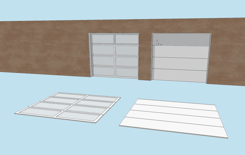
- Object (NEW):Â Garage Door (Frosted Glass, 7-0 x 8-0) door panel
- Object (NEW):Â Garage Door (Simple, 7-0 x 8-0) door panel
- Object (DELETED):Â Simple Garage Door (replaced with two new door panel Objects)
- Layer Combination (Revised):Â 4 | Site – Tree & Plant wasn’t showing up on the 1 | Site Plan Layer Combo
- Layer Combination (Revised):Â Â 1 | Floor.sheathing had the wrong Layer Intersection Group number on the 0 | All On Layer Combo (it was set to 0, should be set to 1)
- Layer (NEW):Â 5 | Structural – Trusses
- Layer (NEW): 8 | Object Creation
- Pen Sets (Revised): fixed names and line weights of unused Pens (all Pen Sets)
- View Map (Revised): 01 Exterior Views and 02 Interior Views clone folder Renovation Filter changed to 5 | Planned Status
- View Map (NEW): Object Creation view in the Details & Interior Elevations folder.
Items #38 and #41 require some explanation. They are an experimental addition to the template. On most projects I end up making one off items, typically door panels-see items #32 and 33, and the slideshow below. Usually they aren’t worth saving for future use (that might be a mistake). Mostly they are variations explored during design. To better track and unify these experimentations, and make integration into the template easier, I’ve created a new Layer and View for element construction. Now I’ll be working in the same area on every file, using the same basic elements, and following similar protocols. Hopefully this will make it simpler and faster to build custom elements.
Time to download the template!
As always the template is free; clicking the PayPal support button (below or on the template page) is optional. If you support my template with a contribution of $100 or more and send me an email with your address, I’ll ship you an 8 oz tumbler as a thank you.
What are you waiting for?
Go download the Shoegnome Open Template for Archicad 24!
If you aren’t using the current version of Archicad, you can download older versions of my template. If you use my template, I highly recommend you use my Work Environment as well. The two work together well and the Work Environment is designed to reinforce the best practices of the template. You can download my Work Environment here.
If you want all the latest Shoegnome Open Template news, sign up for the mailing list below. I’ll only send e-mails about the template:
Sign up for the mailling list!
Subscribe to my blog to read more about the tricky world of being an Architect in the 21st century. Follow Shoegnome on Facebook, Twitter, Instagram, and Youtube. If you have questions about the Shoegnome Open Template or need older versions of the template (all the way back to Archicad 17), check out the FAQ.
