This guest post is by David Jefferis.
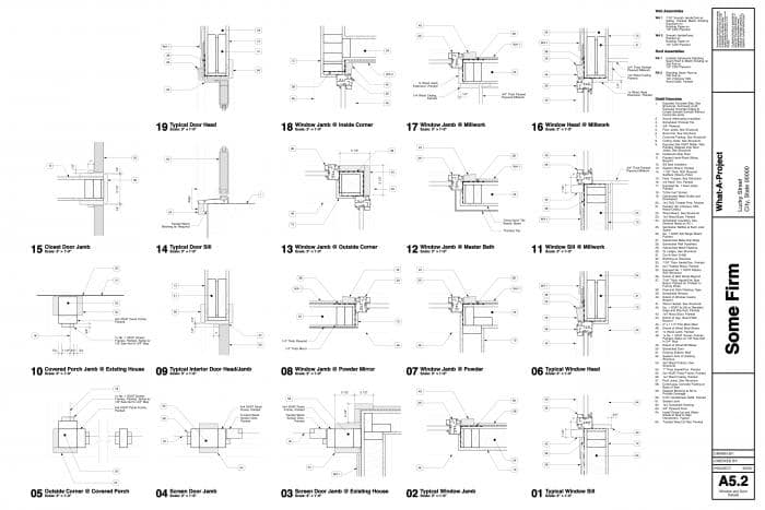
My preferred style of notation breeds the Full Text Note with the Full Keynote to produce the Hybrid Note. The primary problem with both styles of notation presented last week is the lack of hierarchy: special details or materials are not given special treatment and can get lost amid the notes for standard assemblies. Using the Hybrid Note system, these standard assemblies such as wallboard, base trim, and insulation are keyed. Complex or custom assemblies and materials are called out on the drawings directly as text, calling special attention to these conditions. Combining text and keys in this way also reduces the weaknesses inherent in their pure states. Since unique conditions will show up only a few times in the set (else they would be typical and become a keynote), it reduces the amount of text to review. The lack of hierarchy within the keyed notes also becomes less of an issue since there are fewer of them, and their repetition aids memory and reduces the need to constantly reference the key. I use this style for almost all new construction, where unique conditions always arise, and renovations and additions, where typical assemblies meet unique existing conditions.
Serial Notes versus Specification Sections
I’ve written and illustrated the last two posts assuming that keynotes use serial numbering (1, 2, 3, etc.). It is possible to improve the effectiveness of both the Full Keynote and the Hybrid Note styles by keying the notes to specification sections. For example, one could use the key (9.25) for gypsum wallboard. Since I rarely work on large commercial or institutional projects where complete and detailed specifications are prepared simultaneously with the construction drawings, I usually use a simple prefix and suffix method to denote the section. For example, using the prefix 9 for finishes and serial suffix 01, 02, 03, etc. for any finish notes results in the numbering series 9.01, 9.02, 9.03.
Constructing the Keynote
Unique Symbols: It’s good to be different.
Establishing a unique graphic symbol for keynotes is fundamentally important for easy legibility, especially on plan and elevation sheets where there may be many different types of symbols. Basic geometric shapes (Circles, Squares, Triangles and Hexagons) are usually already claimed by doors, windows, equipment, revisions, or other standard components. My preference is for hybrid shapes, such as the rounded rectangle used throughout these examples. Elongated hexagons or ovals are other good options.
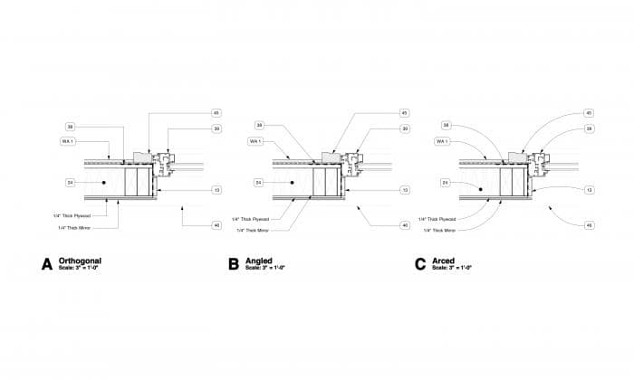
I have used all of these leader lines types at various points in my career and I believe that they all have their strong points. The orthogonal style can be made most compact and is simplest style to use if it is important that all leader lines are aligned. The angled style is the fastest to use, as long as one is not too picky about perfect alignment of the leader lines; on the drawings I’ve seen this style is also the most common. Finally, the arced style is most easily legible: since details for even curved forms tend to be drawn with many orthogonal lines, the leader lines stand out from the drawing they annotate. Also, alignment of leaders is not as much of an issue since a variety of curves is not as visually distracting as many different angles.
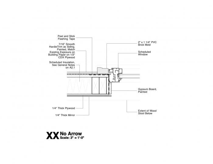
If you’ve ever worked in an office, you are familiar with the arrow as the more or less ubiquitous way of pointing at detail conditions. I was introduced to the leader line with no arrow through European drawings and construction manuals. I believe that it actually aids clarity since there is no arrow tip to obscure portions of the drawing. It also simplifies the graphic presentation. However, this is one point where I have often given in to convention, since the arrow is a nearly universal standard. The example image is shown with Full Text Notation and orthogonal leader lines since this is how I’ve usually seen it deployed in drawings.
About the author:
David Jefferis is a licensed Architect and principal at Grayform Architecture in Houston, Texas. Though ArchiCAD is his preferred program, he has extensive experience on multiple modeling and rendering platforms. His primary interest is in general techniques and theories of standardized architectural representation, with a specific focus on the ways in which BIM software alters the way these drawings are made by expanding the amount, availability, and types of graphic and textual information.


6 thoughts on “Greater than the Sum of the Parts – guest blogger David Jefferis talks about Hybrid Notation”
David –
This is an excellent article! I’ll share it with my clients and members of the Best Practices Course since it is so easy to understand and elucidates an often confusing topic.
Eric
Good to think about this kind of thing every once in a while. I appreciate the emphasis which the hybrid approach allows. Using keynotes at all on details complicates the already-sufficiently-onerous task of banking those details for future use, if one must also save the related key notes as well as what is actually in the detail view in order to preserve the meaning of the detail tags. I also wonder about how to train staff about when to use text, and when to use a reference number (what is a “standard” and what is not. I worry too about the temptation to use a typical generic note when there is really more that needs to be said.
I use key notes on plans where space is at a real premium, but use full text noting on Sections, Elevations, and Details. Occasionally, I put a border around critical text like “Attach GWB to Resilient Channel only. Do not attach GWB to other framing.” I use borders where I suspect the note might be missed, and important functional or safety issues are at stake.
In this way, the detail can be reused without chasing down the meaning of reference numbers (keyed notes). It does take a little more space.
I couldn’t help but notice the nice detail layout on your example sheet probably from a detail library. Are such editible ArchiCAD detail libraries available for purchase…or trade….or free download? If so where.
Bryan, are you just looking for the formatting or the details themselves? There is an object in ArchiCAD (can’t remember the name off hand) that helps you align text and layout the details in the grid.
This file was actually created in Vectorworks 2011 using custom detail templates that I developed to assist drawing layout. I’ll alert Jared Banks (site operator and master of all things ArchiCAD) of your question and see if he can help you out.
Pingback: My Homepage