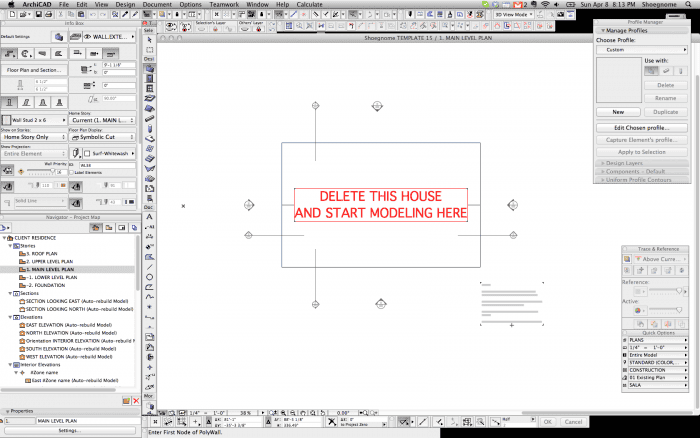
A month ago I posted an 8 minute video discussing a few aspects of my Work Environment in ArchiCAD. You can read the original post and watch the video here. There are some really good comments as well, so don’t forget to check those out. Anyways, at the end of the post I asked for readers to send me screenshots of their Work Environments. Below is the first in a series of posts sharing the Work Environments you sent me.

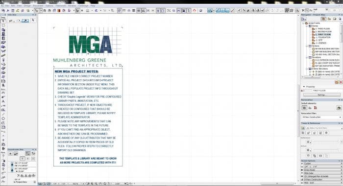
This first Work Environment is from Scott Graham of Muhlenberg Greene Architects, LTD. As a bonus, make sure you check out the ‘NEW MGA PROJECT NOTES’ that are part of MGA’s basic template. Some good info there too!
Here are some of his comments:
- I personally prefer to keep my navigator palette over to the right. I haven’t had much trouble reading things, especially with a good system of naming drawings by ID as well as name. Windows is a little better than Mac at this, but you should be able to dock multiple palettes underneath the navigator window. It’s a perfect fit for the Renovation Palette, Trace & Reference, and Quick Options.
- The Coordinates Box in Vertical Format, fits nicely under the Info Box, and occupies that space that is normally empty in the Info for most tools. This let me move the Control box to the upper right where I had some extra space in my tool bars area anyways (OK & Cancel are cut off a little, but in 9 years of AC, I have not once ever pushed these buttons). Net result is an extra half inch or so along the bottom.
- The Status bar is fairly useless for anyone over novice level, so I usually turn it off and get an extra ¼” along the bottom.
- I currently only keep two tool bars at the top of my screen, one is On-Screen view options, and the other is a customized Toolbar that holds the few things I use a lot but don’t use a shortcut for. Adding whole menus as “sticky” pop ups adjacent to a related icon saves lots of tool bar space. I actually have extra space up there I may need to look into better utilizing.
- I re-order my Toolbox into Design, Document, and Other categories. This way I can keep my more infrequently used tools at the bottom of the list instead of having to scroll down for them all the time. There’s also options to show icons only, and to make it so certain divisions in the toolbox are always open, while others can collapse when not needed.
Scott, thank you so much for sharing this. And thanks to everyone else who sent me images. I’ll post more shortly.
Haven’t shared your Work Environment? It’s not too late, I’ll keep posting as many as I get.
6 thoughts on “Work Environments in ArchiCAD — part 2A”
My two screens workspace
http://imageshack.us/photo/my-images/823/screen2xc.png/
http://imageshack.us/photo/my-images/824/screen1lq.png/
Costas, Thanks for sharing. I just love seeing other people’s Work Environments. Can you e-mail me those so that I can put them in a future post? jared @ shoegnome.com Thanks!
As I teach ArchiCAD to students, I stick with the default Work Environment. It is not too bad. But I don’t like the plethora of floating boxes in OSX. I’d prefer the monolithic single window of the Windows version.
jared and all WE contributors,
looking forward to the ever evolving WE world and v16 enhancements.
thanks for your great blog!
tim
Tim, Thanks! So glad you’re enjoying the blog.
Hi Jared, hi every one!
I too like to keep the navigator on the right, éventuellement IF it´s a bit to thin to read everything well, because I prefer having the main Windows centered.
The vertical info box is good too.
So my WE looks a lot like Scott´s.
Cheers