Home  /  BIM and ARCHICAD   /  Pen Sets, Part One

Pen Sets, Part One

History lesson. My two favorite changes between version 9 and version 10 where the merging of Plotmaker into ArchiCAD and the arrival of multiple pen sets. There is a lot of power and utility with multiple pen sets.

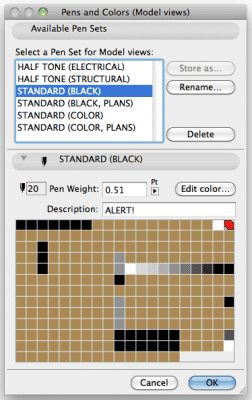
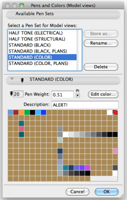
At SALA Architects, I use 6 pen sets on a standard project. In this post I’m going to discuss the basics of two:

one pen set, with colors: STANDARD (COLOR)
one pet set, in black but with the same line weights: STANDARD (BLACK)
Drawings placed on layouts can be set to black and white, grayscale, or original colors. And they can use either the pen set saved with the view or be overridden. Using black and white or grayscale is too limiting. With black and white one clearly gets two options for colors: black or white. With grayscale each colored pen will print slightly different. Neither acceptable options in my opinion. And no one wants to see printed drawings with blue doors, green walls, and pink dashed lines. One could also just always work in black pens. But that’s too limiting as well.

To work in color or black and white? Colors are an additional layer of information. Color = line weight. When I see a specific color on the screen I understand its printed thickness–even though I’m almost always working in hairline (also important, but that’s another post). I find working with black lines a poor decision because you either can’t read line weights or have to work in true line weight which creates a boatload of other issues.

My ideal solution is to be able to work in color, print in black and white but also have access to grayscale and moments of color as needed. Some pens switch between color and black. Others switch between color and gray. Others (pens 91-100) stay grayscale. Pen #20 is special. It’s always red, regardless of pen set. This pen allows me to highlight question areas on a printed or PDF set. It makes communication with engineers or coworkers I don’t have time to talk to much easier. Used as a drafting line it leaves no question what is final work and what is not.

All the unused pens in both pet sets are set to a god-awful color. I’ve set my unused pens to a horrid brown. That way if an unused pen shows up it’s glaringly obvious. The brown pens have more use than just a warning that the pen is wrong. A brown pen is an open pen. So if in a project I need a pen that prints orange or green or blue, I can co-opt any brown pen because I know it’s not being used elsewhere. Multiple pen sets also allow for easy color investigations. If an elevation is colored with pen #33, switching between pensets (where pen #33 changes) means without changing the model, you can view various options. When I was designing the business card for Shoegnome this made my life much easier. I created a card using 3 pens. By changing the pen sets, I was easily able to look at different color schemes without having to duplicate the card.

There’s a whole lot more to these pen sets, but I’ll save that for another post.

Proceed to Part Two…

Save

Comments

  • January 17, 2011
    reply

    Pingback: Tweets that mention Pen Sets, Part One | Shoegnome -- Topsy.com

  • January 19, 2011
    reply

    I have found the issue of Pen set standards a hard thing to enforce in many offices.
    These simple steps do make such a great difference in detering people from using their ‘freedom’ to use whatever pen colour they find on the pen set.

    Great idea and thanks to you now implemented in our office.
    http://www.elevationarchitecture.com.au
    http://www.hugoriveros.com

  • April 18, 2011
    reply

    Daniel

    Thanks for this article. One of the issues I have with archicad is getting my elevation lineweights to read correctly and thus prevent keeping these drawings as ‘live’ Hopefully a separate penset will go some way to solving this issue. Do you have any other suggestions? Thanks again.

  • April 27, 2011
    reply

    Thanks for the response Jared, much appreciated. I have got some way by using the ‘overline’ method you described but would ideally not have to go down this route.

    Removing the design communication from the CDs is a good way to think about it.

    I came across the following method for pensets on the archicad wiki but found it difficult to get my head around and I’m guessing would be just as difficult to manage. I’d appreciate your thoughts http://www.archicadwiki.com/Pen%20Sets

    Thanks Again

  • May 3, 2011
    reply

    That’s what I was hoping to hear 🙂

    Cheers

  • August 7, 2013
    reply

    john

    Will someone please tell me how to change the line weights of a brick sill? I have been pulling my hair out

  • December 30, 2013
    reply
  • November 17, 2014
    reply

    Jared,

    Thanks for all of the great posts! First off let me start by saying I’m new to BIM and ArchiCad. I have 30+ years experience using AutoCAD and MicroStation but all has been in 2D.

    I recently started a new job with an Architectural firm that only does high-end residential construction using ArchiCad. The first task I have been given is to establish and implement office cad Standards which at this point is non-existing.

    I felt the quickest way to achieve this was to use a purchased template (Master Template by Eric Bobrow) which so far has worked quite well. My biggest issue is with pen sets and plotted output.

    I really like your simple approach and agree that you don’t need a boat load of pens. But, I can not find any information about ArchiCad default pen settings or logic for the US version.

    What do you do about the default pen settings for objects? Do you adjust all of your composite pen settings to use your defined pen sets and then save them as favorites?

    Thanks in advance for any suggestions you might have,

    Eric Miller
    Norris Architecture
    http://norrisarchitecture.com

Post a Comment