Here’s Part 2C of my series on Work Environments. Have you read Part 1, Part 2A, and Part 2B yet?
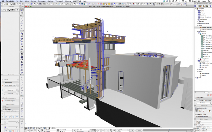
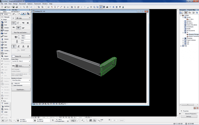
I think these two Work Environments go together well. While on the surface these two might look very similar, look closer. The first Work Environment is from a Mac and the second is from a PC. The big benefit of the PC Work Environment is that palettes can be minimized. I really wish we had this option for Macs. Also the second Work Environment has fewer buttons in the tool bars across the top of the screen and less palettes along the sides of the screen (even though about the same real estate is used). I think both are good solutions. Sharing these two WE is also a good time to mention that you really should show element attributes in the toolbars (like both of these Work Environments do). You need easy access composites, pens, fills, materials, etc. If they are visible on screen, you’ll be more likely to work with them. If they are hidden in a sub menu, then they’ll be easily forgotten. Element Attributes will get a video and blog post to themselves sometime; they are super important and they are the buttons I use more than any others.
Of course the other big difference between these two Work Environments is background color. The second goes with a black background (I’ve also seen and been told about dark gray and canary yellow backgrounds, among others). There are a lot of arguments for colored backgrounds – gentler on the eyes, easy to use in a dark room, etc. I think they are all valid. BUT… whether you go with traditional ArchiCAD White or some other color, I highly recommend EVERYONE in the office use the same background color. Otherwise, I promise, problems will arise with pen visibility, especially with fills.
Expect more Work Environment Posts soon. Thanks again to everyone who’s sent me their screen shots.
Haven’t shared your Work Environment? It’s not too late, I’ll keep posting as many as I get.
